
It’s almost the middle of fall, and weddings and parties are in full swing! This week, we’re sharing inspiration for your upcoming events! You will absolutely love all of these color combinations, especially for your next party.
When you are organizing a get-together it can be hard to choose a theme that can fit both the mood and the season, which is why we are here to help. These 3 color combinations can work with almost anything during fall.
You can find several items in the BalsaCircle store in these colors, so make sure you check all of them out, not just the ones listed below. We wouldn’t want you missing out on your next favorite party decorations!
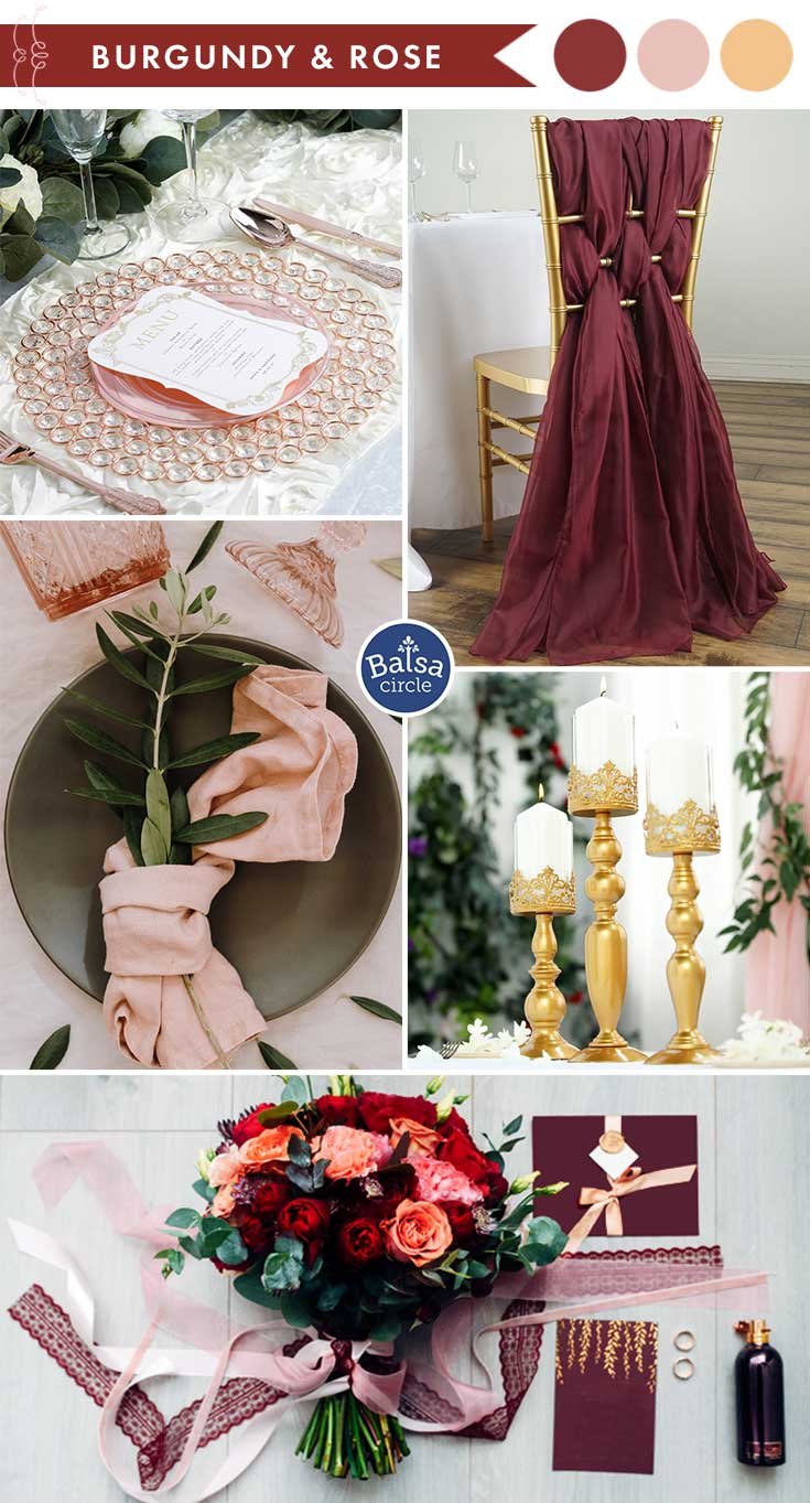
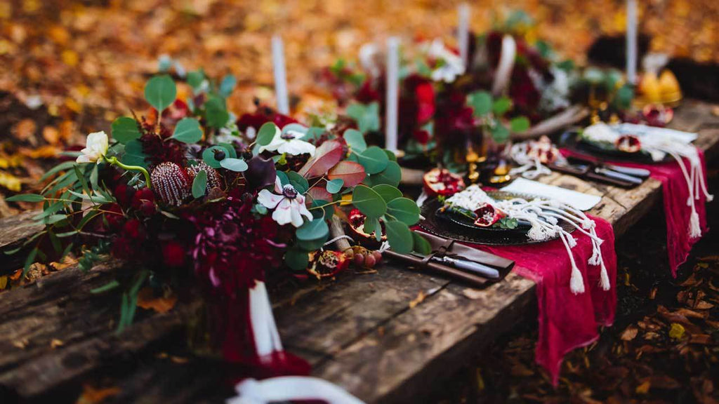
Burgundy & Dusty Rose
Two hues of red. These remind people of the way the leaves slowly start to darken, then fall. These colors are perfect if you are only going with seasonal ones, as they are the first shades that come into the mind of anyone during this time.
The darkness of burgundy and the light silky color of dusty rose complement each other really well. Because of this you should put the two in close proximity of each other, as it will bring out the colors even more. For example, you can use a burgundy tablecloth, that sets a deep and calming overlay, then put a dusty rose table runner on top. Just imagine the possibilities! These colors create an amazing contrast without appearing too harsh.
They are also very elegant, which means that you can use these colors for formal or informal parties. Either way, they will work really well.
To keep the palette from being too monotone, make sure you add a third color for contrast. The best would be white, as it would highlight these oh-so-perfect shades.
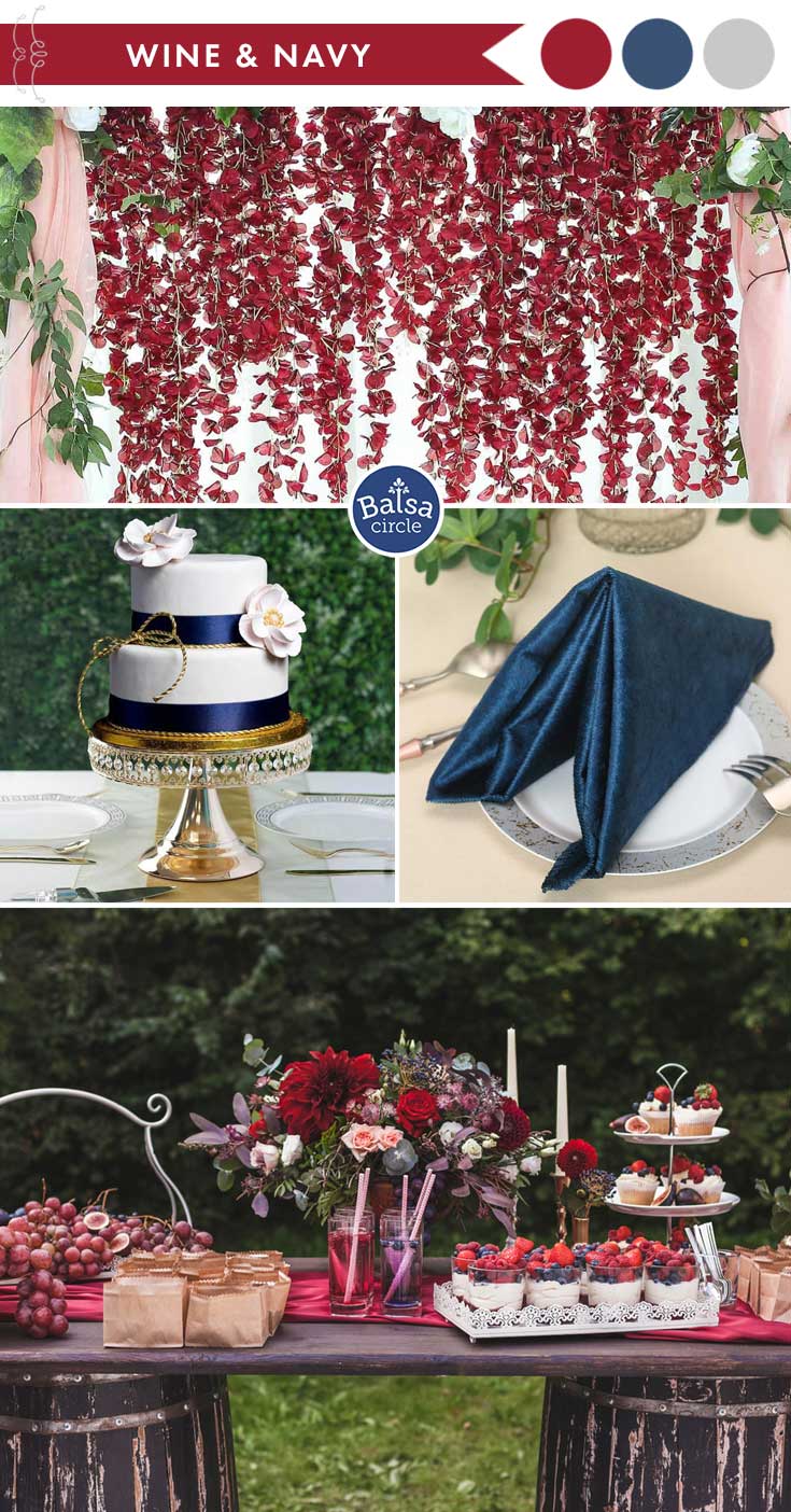
Wine & Navy Blue
These shades are so daring! Wine is very intimidating and deep. We connect this color to emotion and flame. It will most definitely be noticed by all the guests, and because of this you should use it next to something you want to highlight. For example, if you have a centerpiece, then you can place artificial peonies next to it.
It guides the eyes and makes sure that everyone knows what to notice. It’s a great way to guide people, and it’s just simple color psychology.
Navy blue on the other hand is much different. It makes people calm and relaxed, which is a huge contrast considering the energy of wine red. This shade of blue shouldn’t be kept right alongside the reds, as it can create too much competition between them. It also confuses guests, even if that’s not entirely obvious. So let’s say we are going with the example given above with artificial peonies.
If that’s your choice then the closest you can put your blue is at the chairs, perhaps with chair sashes or cushions. This also indicates that your guests are welcome in their seats. Also, the two colors won’t be visible at the same time once you are sitting down. By this you can avoid the high contrast.
All in all, these two can enhance the emotion and energy of one other and that’s why they go together so well for fall.
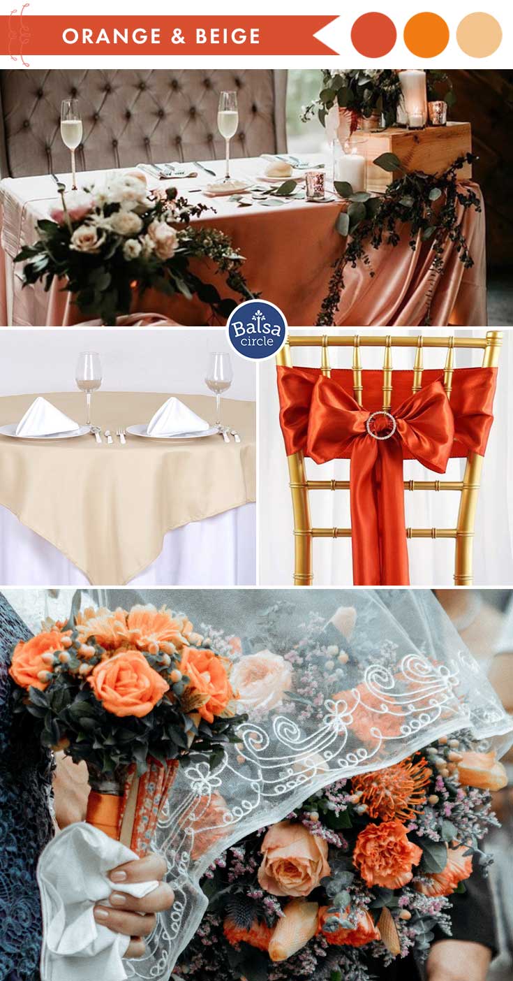
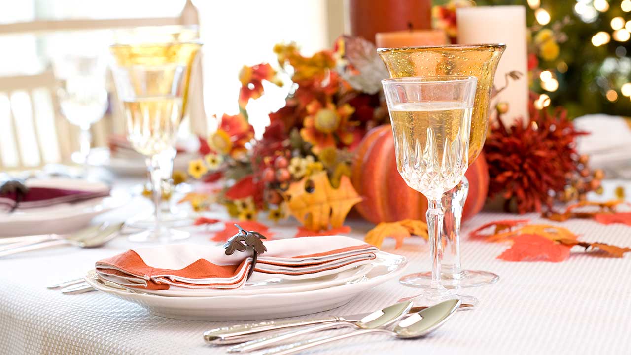
Orange Hues and Beige
What do you think of when you imagine orange as a color? The fruit? A sunset? The falling leaves during fall? All of these are beautiful in their own way, yet all of them are a different shade. But one thing remains common: that they all go really well with beige.
If you want to have a positive and friendly energy at your venue then these are the colors you should choose. They are mostly neutral, they don’t give off any extreme emotions, which can be great especially around children (you should always take color psychology into consideration when kids are present if you don’t want havoc). Because of this neutrality it can be great for any party. Birthdays, formal get togethers, weddings. You name it.
But not only are they neutral, they are natural as well. Most people prefer colors that don’t grab too much attention, the ones that scream out to everyone who sees them. But these light and friendly colors don’t do that at all, they divert the focus on other more important things. It can guide people’s attention without taking away any of it.
And because of the last fact you can cover your entire venue with these colors. You don’t need a third shade to complement them or to give contrast, because they work perfectly fine on their own. Although if these two aren’t enough for you then you can still use a contrast color. In this case you need to choose something simple. That’s a keyword. If you don’t follow that rule then your color combination won’t work.
So, what would work best as a contrast color? White, ivory, black, or even silver would work well.
The best thing you can do is to have beige as a base. Choose items that are pretty big, like curtains or tablecloths. This way you can highlight anything in front of it. But if you go with the tablecloth option then the perfect thing to do is buy orange flowers. Silk roses would work best, so you don’t have to deal with wilting flowers.
We hope one of these three beautiful color combinations inspire your fall decorations! Let us know which palette you liked the best or if there’s another combo you prefer.
You might also like:
Leave a comment